
Your template’s design layout often has images that do not fill the entire width of all devices your visitors may be using. CSS’s grid layouts and flexbox layouts allow even greater control over the design of websites. Using img sizes attribute to hint to the browser the maximum size the image will render at allows developers to reduce bandwidth and fit images to their design rather than the device’s width.
A number of articles discussing this idea, or at least something similar to it, talk about art direction but this idea is different. Most suggest wrapping the img element with a picture element with customized source elements. This allows you do do things like replace the image based on the device size, but requires duplicating the image URL in order to use it to simply define a maximum image size for the design based on device width. This is overkill for simple control of the image resolution.
Content Management Systems (CMS) and blog software including Drupal modules, WordPress and it’s popular plugins have a default of using the device width. They have no understanding of the design’s layout. This is problematic as not all images would benefit from it and some, like icons and logos, may end up causing browsers to download the wrong resolution and leads to images that are either too large or too small for the space the image fills. For most CMSes, the best solution is to simply define them all to be based on the width of the device since it’s extremely rare that images placed on the site would exceed that resolution.
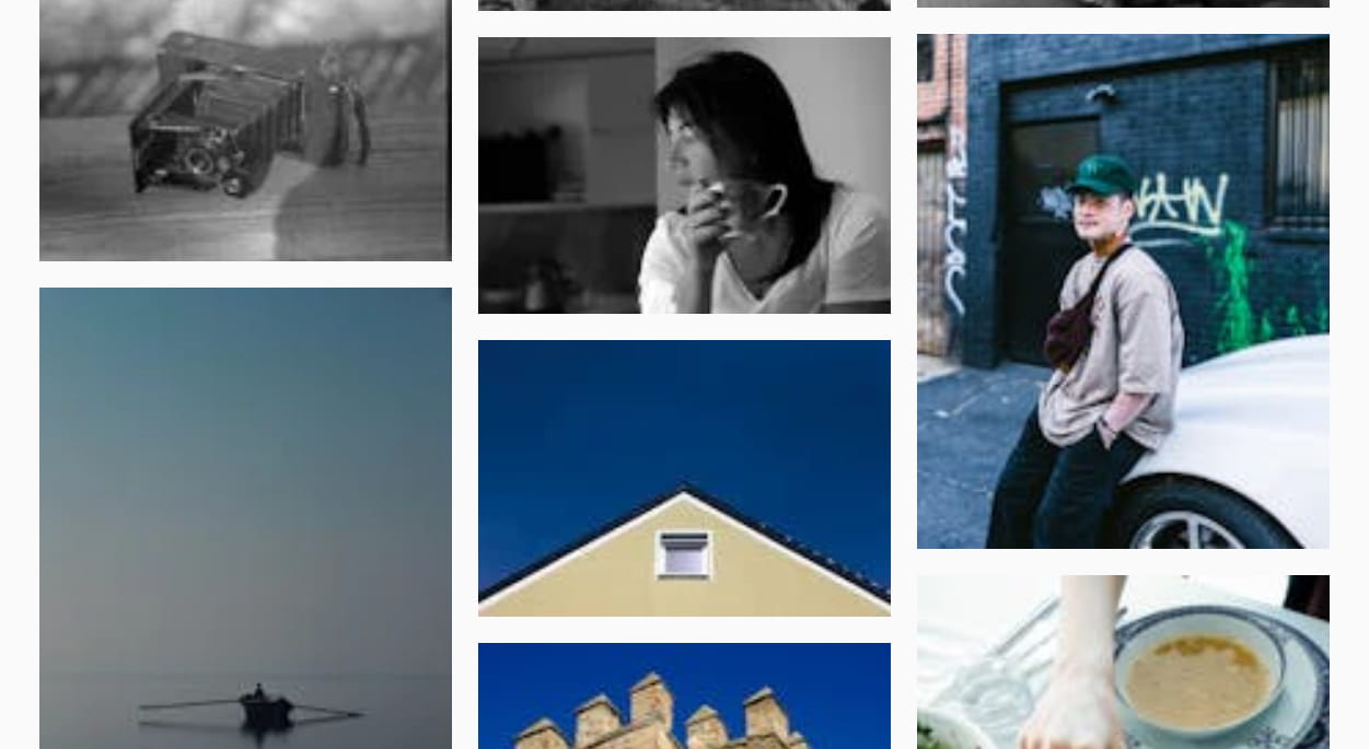
For example, here is an image grid where the img sizes attribute is set to 100px:
You can see the images are all low resolution, even on a desktop display. Now let’s set the img sizes attribute to 100vw (100% the viewport width):
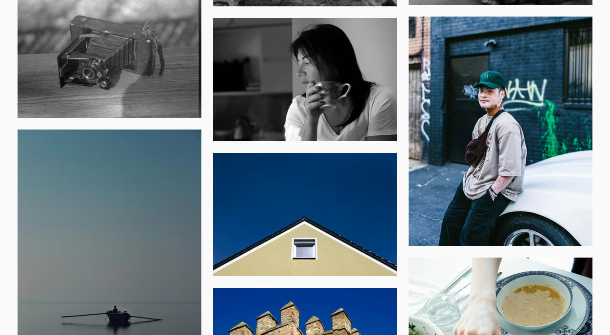
You can see that the images are now crisp and easy to view… but there’s still a problem. They are downloading very large images even though their width is 33% of the screen… minus the padding as well. The browser is downloading images far larger than it needs to. This uses more bandwidth than needed and is slow on mobile devices with slower wireless internet connections.
Customize The IMG sizes Attribute For Each Image Element
Each image element tag needs the sizes attribute added (or replaced) with the customized version. In some cases this can be tedious, but there are things you can do to make the process a little easier on yourself.
Preset, Named img sizes Attribute Values
One way to achieve this is to create a way to store predefined sizes attributes. Make it easier by giving them unique, simple names. For instance, consider a design that has a section that will show up to 5 columns on a 2K or greater screen, 4 columns on a 1920px desktop screen, 2 columns on a tablet, and a single column mobile phones. Here is an example: (max-width: 640px) 100vw, (max-width: 1024px) 50vw, (max-width: 1920px) 25vw, 20vw.
You could call this value “5-column” with the value set to what you would like the img sizes attribute to be, and embed that into all of the img sizes attribute. Instead of trying to remember the value of sizes or copying and pasting it over and over again, you simply tell it to include the 5-column named value. This also has the additional benefit of being able to change many images’ sizes attribute at the same time if that section of the design were to change in the future.
Additional img sizes Considerations
Lightbox & Other Full-screen Modal Image/Gallery Scripts
These scripts take an existing image and “blow it up” to display it full-screen. This is to make images that may be hard to see large enough that the viewer can recognize subjects and possibly text within the image. However, altering the img sizes attribute can potentially be problematic. For instance, your desktop design calls for a 300 pixel (px) wide display and the lightbox script full-screens that image. They appear horribly artifacted/pixelated when displayed at 300px wide on a 1920px wide screen. It would appear even worse on a 2K or 4K monitor. You want to make sure the img tag used by the enlargement script does not simply copy the sizes attribute you have assigned on the site.
How to ensure browsers will download the full-screen version of images when they are enlarged? This is a tricky answer. There are a number of different lightbox and modal image enlargement scripts. Some are forks of existing scripts but and many are independently developed and lack the same features. In general, you want to make sure to have a custom sizes attribute available in this case. I don’t see any of the major scripts’ documentation showing any data-sizes attribute or similar, so you will likely need to hook the modal’s open event and swap out the sizes attribute yourself.