This sweet and savory dish is perfect for a night in. Put on a movie, bring some friends and share a delicious meal. This honey garlic salmon stir-fry an easy recipe that doesn’t take long to make. The rice will take the most time to cook but can be a cinch when using a rice cooker.
This honey garlic salmon stir-fry was adapted from this sauce recipe. As with all recipes, it’s best to make it your own. Add the levels of seasoning you prefer or even add more! I would also add some alcohol – wine or beer – to the sauce (if everyone is of legal drinking age) to add to the flavor profile.
Honey Garlic Salmon Stir-Fry Recipe
Ingredients
1 cup rice
2 tbsp butter
2-4 salmon fillets, 4oz each
1 tsp paprika
2 tsp Italian seasoning
1/2 tsp turmeric or cumin
salt
pepper
3-4 cloves garlic, minced
3/4-1 cup honey
1.5 tbsp soy sauce
2 tbsp lemon or lime juice
14-16 oz stir-fry vegetables
Preparation
Begin preparing rice according to directions (will be different depending on the type of rice used). The rice will take the longest so put it on first. You can even wait until the rice is about half-way through before starting the rest.
Mix honey & soy sauce in a small bowl
Add a small amount of oil and 1 tbsp butter to a large skillet and set to high heat
Add vegetables and saute until they begin to brown, season with Italian seasoning while cooking
Turn heat down to medium-high
Season salmon with paprika, turmeric or cumin, salt, and pepper (to taste)
Place salmon skin-side down on the pan and cook 3-5 minutes (until about 1/2-3/4 cooked through)
Pour 1/2 of the honey and soy sauce over the fillets
Add remaining butter and flip fillet
Top with garlic
Flip fillet and pour remaining honey sauce over it
Cook another couple minutes, spooning sauce over the fillets until they are fully cooked and easily faked with a fork
Remove from heat
When rice is done, add to bowl and top with stir-fry vegetables and salmon fillet
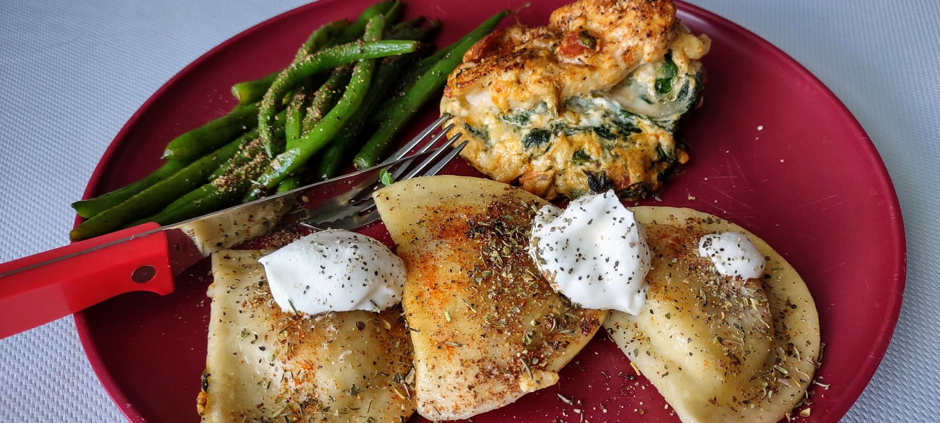
This recipe is quick and easy and includes common garden herbs. I used some fresh cherry tomatoes and basil from my garden (shredded the leaves into small pieces and sprinkled them into the ingredients). There is only about 10 minutes of prep and 20 minutes of cooking (depending on oven and chicken thickness), about 30 minutes total.
Spinach stuffed chicken goes well with many different sides. I used potato & onion pirogi and fresh green beans but pairs well with various other types of potatoes and vegetables. Other alternatives include rice, pasta, mushrooms (such as steaks or a mushroom gravy), or just a salad. Some even wrap the stuffed chicken with bacon. Let your imagination and taste buds steer the ship.
3-4 handfuls of fresh spinach (it will cook down massively, add to taste)
3 oz cream cheese
1/4 teaspoon basil
1/4 teaspoon oregano
1/4 teaspoon onion powder
2 1/2 tablespoons minced garlic
3-4 cherry tomatoes, chopped
Preparation
Preheat oven to 375°F
Season pan with olive oil over medium high heat
Add spinach and garlic, cook until spinach is reduced and wilted, stirring
Add to new bowl and combine with remaining ingredients (except paprika)
Cut pockets into chicken breast, not all the way through (best to slice through the side)
Add filling to chicken breast and fold partially closed
In the same pan you used for the spinach, re-season pad with oil (if necessary) and sear chicken breasts on all sides
While cooking, sprinkle paprika, salt, and pepper on chicken to taste
Transfer your chicken to a baking dish (if your pan is not oven-safe) and bake for 20 minutes (oven cooking times vary, use a meat thermometer to make sure chicken center reaches 165°F)
If desired, you can sprinkle some cheese (such as shredded mozzarella and/or grated Parmesan) on top and place back in oven for a couple minutes until melted
In the first part, Responsive Background Images With or Without image-set(): The Proven Way looked at the current way to make background images responsive. It is not without it’s down sides. I will discuss these and present a new way to use an img tag, or any tag, as a responsive – and even dynamic and animated – background for any element.
image-set() Con: Existing Content Management System Blocks/Extensions
Block elements and extensions as well as built-in features within existing Content Management Systems (CMS) are all designed to use previous and current generation CSS. Image-set() is not meant as a translation of the img tag’s srcset and sizes attributes. Media queries balloon out the size of CSS and are difficult to update and control. Extending existing blocks and extensions don’t always catch every case and many third-party-developed extensions may not even be modifiable.
Many people will continue to use the existing elements and blocks they are familiar with. This means many existing sections won’t be able to make use of new ways to make backgrounds responsive.
Responsive Background Images In The Future: The element() Function
A new CSS function will allow developers to use an old and familiar pattern to easily provide background images that respond and update to size of the viewport of container. Additionally, this function allows the use of more than just images. Animations, dynamically updating content and videos can also be rendered as the background of an element.
The element() CSS function allows you to use any element on the page as the background of any other element. That means images that response responsively to the viewport or container queries. That also means any element with any content – text, images/canvas, video, or dynamically updated and animated content.
This function also allows developers to bypass existing CSS generations and implement an entirely new background image using an img tag, even a tag that already exists within the site – such as a featured or headline image.
Granted, this is rather winded, but not as much as when using CSS media queries. The img tag can more easily be generated by most CMSes while I have not seen any that generate media queries.
You can mimic this today, in all browsers, using a stack.
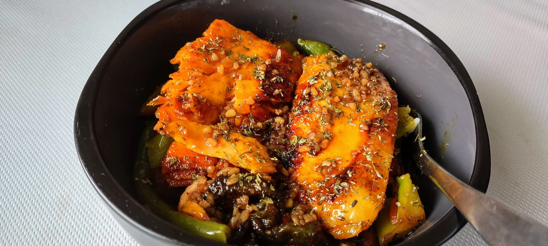
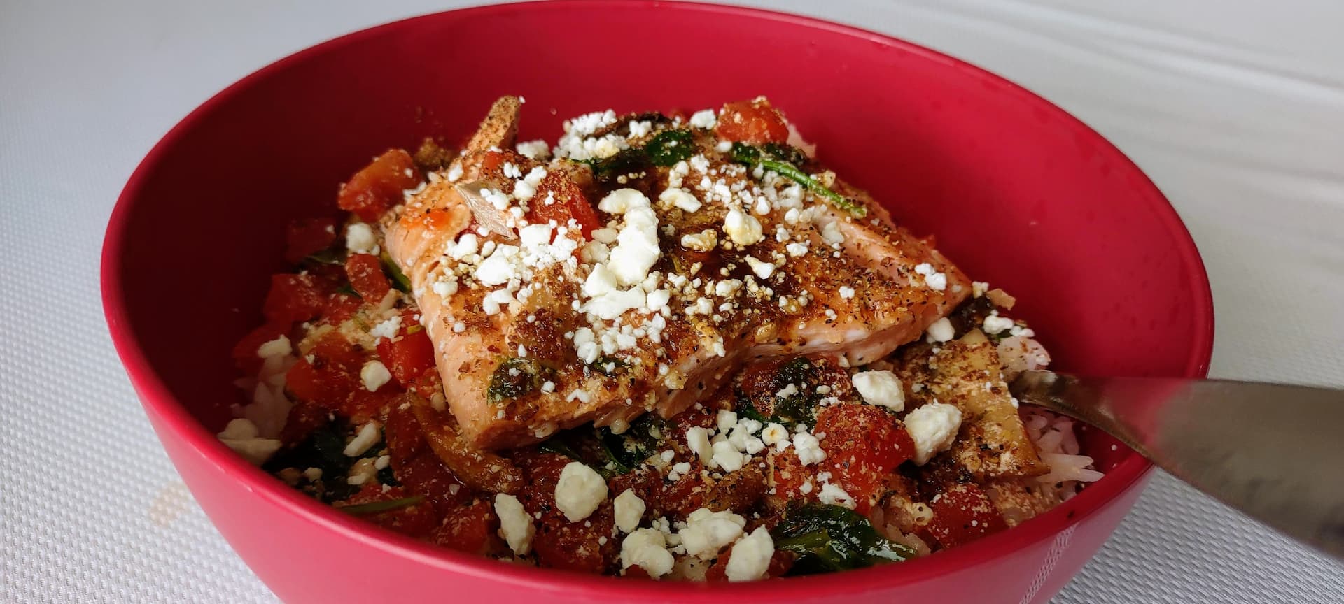
This recipe for Tuscan salmon & mushroom risotto with feta cheese is actually fairly common. However, like most recipes involving a sauce, it never produces enough. I end up lacking enough sauce for multiple servings. I have modified and added some additional ingredients to add my own flair and to make sure there is enough sauce so that 4-6 servings can be made without leaving the rice dry.
This is a delicious and quick dinner recipe that is tasty and healthy. I’ve made it multiple times and is one of my go-to favorites. It only takes about 30 minutes to prepare and make (remember to put your rice on before you start so it can cook while you are preparing the sauce and fish). It is also a colorful dish with red tomatoes, green spinach, and white feta against the golden-brown salmon fillet.
Tuscan Salmon & Mushroom Risotto with Feta Cheese Recipe
Ingredients
2 salmon fillets
2 cloves minced garlic
2 cups heavy cream (or 1⅓ cups milk & ⅔ cup melted butter)
1 cup chicken broth
1 tbsp Italian seasoning
1 handful or fresh spinach (torn or about ½ of a 16oz can of spinach leaves, drained)
A couple handfuls of cherry tomatoes or 16oz can of sun-dried or diced tomatoes
8oz package of fresh or canned mushrooms (drained, sliced)
1 cup rice (can be Arborio or your favorite variety)
feta cheese
salt
pepper
Preparation
Prepare rice as directed and to taste – I use a rice cooker that generally takes about 30 minutes to cook
Season with oil and heat large skillet to medium-high
Pat-dry salmon fillets and season with salt & pepper
Add salmon fillets skin-side down and brown 3 minutes each side, set aside
Add mushrooms and saute to taste, set aside
Add garlic and tomatoes and saute 1-2 minutes
Add cream, broth, Italian seasoning and mushrooms and bring to a boil
Reduce heat and simmer 5-10 minutes
Add spinach and simmer an additional 1-2 minutes
Turn off heat and add fillets, let sit for a couple minutes to cook fillets further, if desired
Add rice to bowl, pour Tuscan sauce over, add fillet and top with additional sauce as desired
Top with feta cheese to taste, if desired, and enjoy
Oh, you’re back. Notice anything strange? For example, nobody can decide on what this means, how to do it, or even how to do it easily? You’re not alone. Fact is, the vast majority of sites have incorrect answers for generating responsive background images the way the img tag with srcset and sizes attributes work. This post puts it all to rest with the definitive answer a few mention as an “option” rather than the answer. Let’s start with a definition.
What are responsive background images?
There is some clear confusion over what exactly constitutes a responsive background image. Many declare them, simply, as the act of using a background image and that they are inherently responsive. Others define them as the filling of a given space by setting the background-size property to cover or contain. This inconsistency makes the entire idea confusing; They define the background styling an HTML element but not making the background responsive.
images that work well on devices with widely differing screen sizes, resolutions, and other such features
MDN
In other words – just adding a background image to an element or even having it fill a given space does not constitute a responsive background image… but it does contribute to it.
Image-Set() Is For Pixel Density & Type Support, Not Responsiveness
Many posts will erroneously tell you to use image-set() to make background images responsive. This is misleading at best. image-set() was not meant to be used to provide different images at differing device screen widths. It is meant to provide different images based on the pixel density of the device. I already know what some are going to say…
But pixel density does fit with device size!
Unfortunately, you would be wrong. Using pixel density (such as DPI or 1x, 2x, 3x, etc) as a way to target a mobile device vs a tablet vs a desktop won’t work. While most mobile phones do use higher pixel density than most desktop monitors, others do as well. A number of tablets also have higher pixel density and Apple’s high DPI Retina display is (or was) available on their desktop machines as well. Just because the vast majority of the rest of the industry did not go in that direction does not mean you should simply assume only certain devices make use.
What does this all mean? Using image-set() by itself as a way to define device-specific images is not likely to get the results you expect and does not mean your background images are responsive. The following code will not hit the majority of cases you would expect to hit when setting different sized images for mobile devices, tablets, and desktops:
CSS
// Don't use this to target mobile, tablet, or desktop devices.some-element {background-image: image-set(url("/path/to/regular-image.webp") 1x,url("/path/to/regular-image.2x.webp") 2x );}
Responsive Background Images Revealed: The Proven & Tested Solution
While various articles and StackOverflow (SO) question answers may tell you to multiple background-image properties (possibly using some JavaScript-set class), use image-set() by itself, or some other JavaScript (JS) to swap-out images, DON’T. They all have huge downsides. Everything from loading multiple versions of image, which uses even more bandwidth and loading a single image, to delaying the loading of images to increasing the amount of blocking scripts unnecessarily. There is a much better, pure CSS way to handle responsive background images.
The tested and proven way is to use media queries. Yep, I said it. You may not like it, but as of 2024, it’s the primary way to generate responsive background images that target different device widths the your breakpoints and img tags do. Here is the tested and proven solution, JS involved:
CSS
/* Use your own breakpoints or, better yet, generate this dynamically within your CMS (such as through an extension/plugin or theme): */// Mobile first! Up to 767px:.some-element {background-image: url("/path/to/image-767.webp");}// Tablet (768px to 1023px)@media (min-width: 768px) {.some-element {background-image: url("/path/to/image-1023.webp"); }}// Smaller laptops and tablet in landscape (1024px to 1279px)@media (min-width: 1024px) {.some-element {background-image: url("/path/to/image-1279.webp"); }}// Standard laptops and desktops FULL HD (1280px and up)@media (min-width: 1280px) {.some-element {background-image: url("/path/to/image-2048.webp"); }}// You could include more queries if you are targeting// 2K, 4K, 8K screens, etc.
The code above will allow your site to display responsive background images to varying device sizes while reducing bandwidth for smaller devices. You can even use art direction. For instance, if your desktop layout has the element only needed in 500px wide background, you can set your larger display to only download the smaller size image. It is the img tag equivalent of:
You can even use image-set() in addition to the media queries to target both device sizes as well as devices with higher pixel density/DPI/PPI. Performance analyzers like Lighthouse’s Pagespeed Insights will also thank you for taking the responsive route for background images.
Your template’s design layout often has images that do not fill the entire width of all devices your visitors may be using. CSS’s grid layouts and flexbox layouts allow even greater control over the design of websites. Using img sizes attribute to hint to the browser the maximum size the image will render at allows developers to reduce bandwidth and fit images to their design rather than the device’s width.
A number of articles discussing this idea, or at least something similar to it, talk about art direction but this idea is different. Most suggest wrapping the img element with a picture element with customized source elements. This allows you do do things like replace the image based on the device size, but requires duplicating the image URL in order to use it to simply define a maximum image size for the design based on device width. This is overkill for simple control of the image resolution.
Content Management Systems (CMS) and blog software including Drupal modules, WordPress and it’s popular plugins have a default of using the device width. They have no understanding of the design’s layout. This is problematic as not all images would benefit from it and some, like icons and logos, may end up causing browsers to download the wrong resolution and leads to images that are either too large or too small for the space the image fills. For most CMSes, the best solution is to simply define them all to be based on the width of the device since it’s extremely rare that images placed on the site would exceed that resolution.
For example, here is an image grid where the img sizes attribute is set to 100px:
You can see the images are all low resolution, even on a desktop display. Now let’s set the img sizes attribute to 100vw (100% the viewport width):
You can see that the images are now crisp and easy to view… but there’s still a problem. They are downloading very large images even though their width is 33% of the screen… minus the padding as well. The browser is downloading images far larger than it needs to. This uses more bandwidth than needed and is slow on mobile devices with slower wireless internet connections.
Customize The IMG sizes Attribute For Each Image Element
Each image element tag needs the sizes attribute added (or replaced) with the customized version. In some cases this can be tedious, but there are things you can do to make the process a little easier on yourself.
Preset, Named img sizes Attribute Values
One way to achieve this is to create a way to store predefined sizes attributes. Make it easier by giving them unique, simple names. For instance, consider a design that has a section that will show up to 5 columns on a 2K or greater screen, 4 columns on a 1920px desktop screen, 2 columns on a tablet, and a single column mobile phones. Here is an example: (max-width: 640px) 100vw, (max-width: 1024px) 50vw, (max-width: 1920px) 25vw, 20vw.
You could call this value “5-column” with the value set to what you would like the img sizes attribute to be, and embed that into all of the imgsizes attribute. Instead of trying to remember the value of sizes or copying and pasting it over and over again, you simply tell it to include the 5-column named value. This also has the additional benefit of being able to change many images’ sizes attribute at the same time if that section of the design were to change in the future.
Additional img sizes Considerations
Lightbox & Other Full-screen Modal Image/Gallery Scripts
These scripts take an existing image and “blow it up” to display it full-screen. This is to make images that may be hard to see large enough that the viewer can recognize subjects and possibly text within the image. However, altering the img sizes attribute can potentially be problematic. For instance, your desktop design calls for a 300 pixel (px) wide display and the lightbox script full-screens that image. They appear horribly artifacted/pixelated when displayed at 300px wide on a 1920px wide screen. It would appear even worse on a 2K or 4K monitor. You want to make sure the img tag used by the enlargement script does not simply copy the sizes attribute you have assigned on the site.
How to ensure browsers will download the full-screen version of images when they are enlarged? This is a tricky answer. There are a number of different lightbox and modal image enlargement scripts. Some are forks of existing scripts but and many are independently developed and lack the same features. In general, you want to make sure to have a custom sizes attribute available in this case. I don’t see any of the major scripts’ documentation showing any data-sizes attribute or similar, so you will likely need to hook the modal’s open event and swap out the sizes attribute yourself.
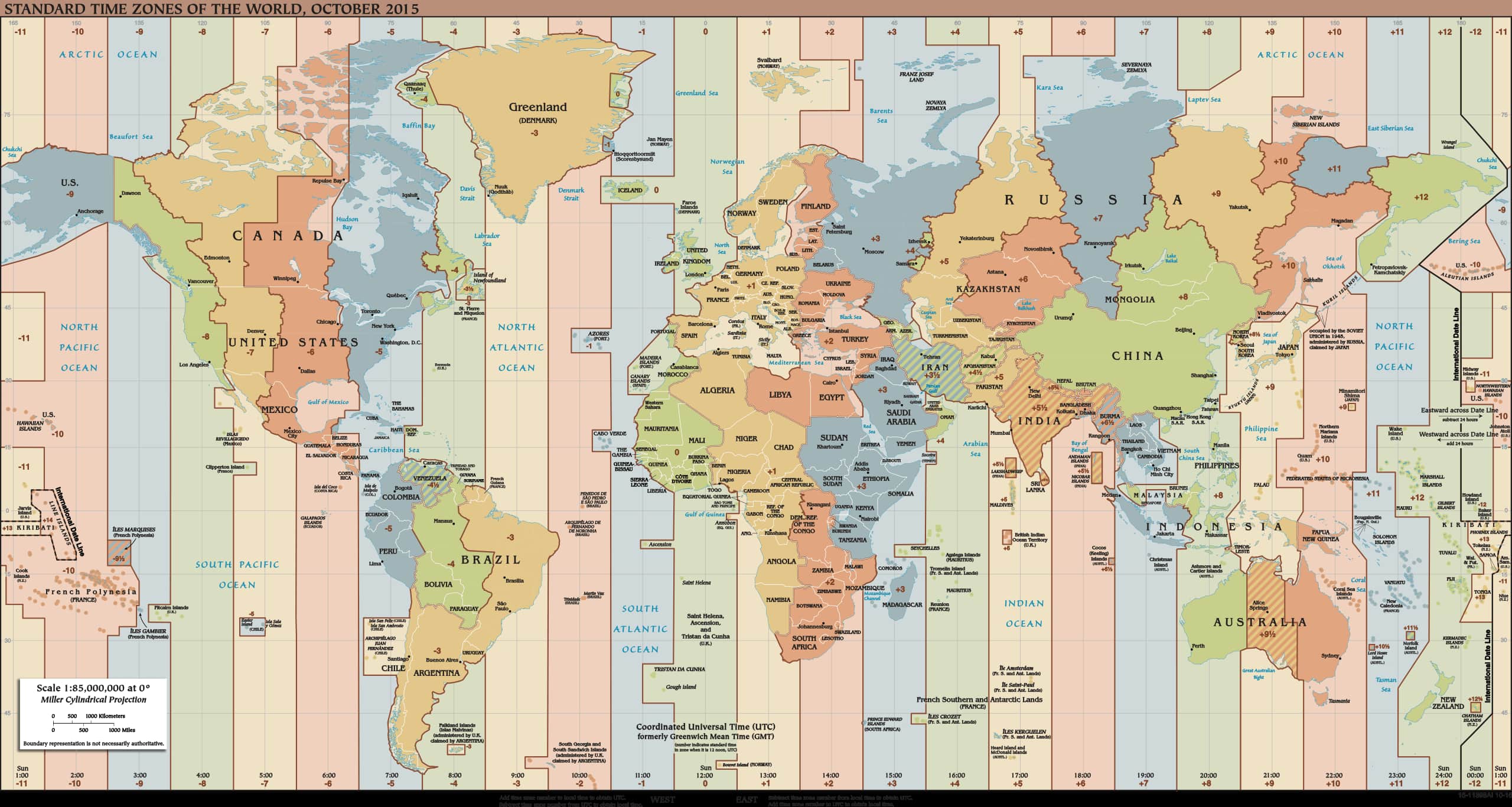
The INTL extension is great for showing translated strings as well as formatting dates and numbers in a way users in different locales expect. But sometimes IntlDateFormatter outputs something that isn’t correct or throws an error. Questions about incorrect or missing time-zone offsets are showing up more often. Let’s go over why that is and how you can fix it.
When you format a date with a given time-zone, the INTL extension calls the International Components for Unicode (ICU) library. That library contains a vast data store of formatting expectations for many different locales (a combination of a countries and/or language). It also includes a list of time-zones, their names, abbreviations, offsets and when and if they use daylight saving time (DST). Except time-zones change periodically and in some cases, quite often.
When do time-zones change?
While most Western time-zones tend to be quite stable with few changes, others do not. The Middle East, Central & South America, Asia and parts of Europe have seen a number of changes over the years. Locations create new time-zones, remove others, and change others if or when they observe DST.
There is no way to predict when these changes occur. Each country and even cities or regions determine when they are going to make a change. They (or others with knowledge of the change) then submit this information to the IANA to update their time-zone database (TZDB). Throughout the year new versions are released.
How to fix a missing or incorrect time-zone
The issue boils down to out-of-date data. Servers want to keep their software as stable as possible. Some are running software that is a decade or more old. It is possible to update the timezone information, even without administrative access.
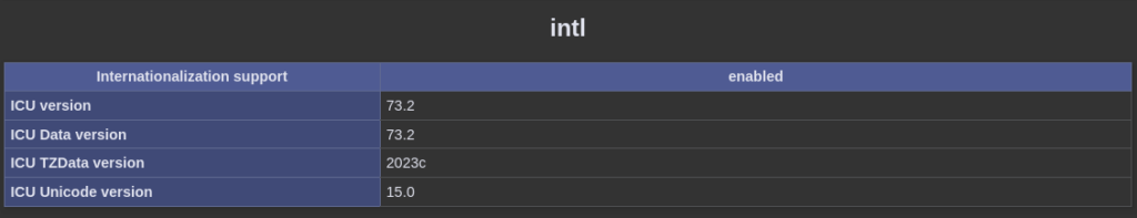
Identify the version of the ICU library that is currently in use by using phpinfo() or the command line to view the installed version.
Running version 54 or newer will allow you to drop-in the necessary files. Otherwise it will likely be more complicated.
To get the right files, browse to the newest directory. It is based on the year followed by a letter. The latest versions are followed by a /44. Within that directory, there are 3 others:
be (big endian)
ee (IBM mainframes using EBCDIC character sets)
le (little endian)
Choose the endianness that fits your system. The vast majority will use little endian. Within that directory will be 4 files:
metaZones.res
timezoneTypes.res
windowsZones.res
zoneinfo64.res
Download and place those files in a directory the web application has access to read. Finally, let the ICU library know to use these files for the time-zone database resource:
Put this script as early as possible in your application. For instance, a bootstrap file or prepend directive. Depending on your server setup, you may need to restart the application and/or web server. The timezone you were missing or time that was incorrect will be correct.
In this PHP INTL In-Depth look, you will understand how to convert integer numbers to Roman numerals (1 => I, 2 => II, 3 => III, etc). There are a few different functions floating around the web on Stack Overflow and blogs. They use an array of values to convert numbers to Roman numerals, but are not needed. Before we get to the code, we need to know what these numerals are:
Roman Numerals? What are those?
So what exactly are Roman numerals? They are a numeral system: a number set represented symbols. Not to be confused with number systems, which are a set of specific numbers. A number system is a more abstract idea of a set of numbers, such as real or rational numbers, while a numeral system is how a set of numbers are expressed, such as decimals or binary in computer hardware.
Roman numerals first appeared in ancient Rome. Europe continued to use until the Middle Ages after the Roman Empire fell. Afterward, they were replaced by the Arabic numerals or Latin digits (1, 2, 3, etc) used throughout much of the world today.
Roman numerals are still used today but are an artistic choice. Examples of where they are still used are circular analog clock faces, company marketing or advertising campaigns, and buildings or monuments with engravings of years.
Roman numerals are read as a basic mathematical expression. Smaller numerals positioned before a larger numeral are subtracted and numbers after are added. For instance, IIV represents the number 3 where V is equal to 5 and I is equal to 1, but since they are placed before the 5 they are subtracted. Numbers of the same or lesser value positioned after a larger number are added. For instance, MMXXIII which represents the year 2023.
INTL: NumberFormatter Decimal Numbering System
PHP’s INTL (internationalization or i8n) library comes with a number formatter class meant to format integers & floats into human-readable numbers, currencies, and accounting. However, there is also a numbering system built into it capable of a few different features. One of those features is Roman numerals.
Instead of creating a function or method to convert numbers to numerals, there is a C/C++ library already compiled and wrapped by PHP: The INTL library. Within that library is a NumberFormatter class which provides access to the powerful ICU Unicode internationalization formatting class.
The formatting class is very powerful and can be used to format a number in various ways. An input is always just a plain, bland, number such as 645002. However, humans have trouble understanding large groups of numbers without something to indicate how many positions there are.
The NumberFormatter can be used to convert that number to a more understandable 645,002. In other countries a dot may be used as the separator and formatted as 645.002. It could also be used to spell out the number as six-hundred forty-five thousand two.
In this case, we want the representation to be a Roman numeral. So we can tell the formatter to use Roman numerals by appending to or replacing the locale with a keyword:
The formatter will also format zero as N and negative numbers the same as positive numbers but preceded by a Unicode minus symbol (not the hyphen/minus symbol on keyboards). There are technically no actual zero or negative Roman numerals. They didn’t exist back when the numeral system was developed so the inclusion of them is a modern representation.
You can alternatively use the MessageFormatter class in the same way:
There is a caveat: performance. In my own testing, this function is about 6 times slower than NumberFormatter. You can use it for individual formats within a string, but if you are planning on using it in a loop or with many messages, it will be more performant use NumberFormatter by itself or pass a numeral converted by NumberFormatter to the MessageFormatter arguments.
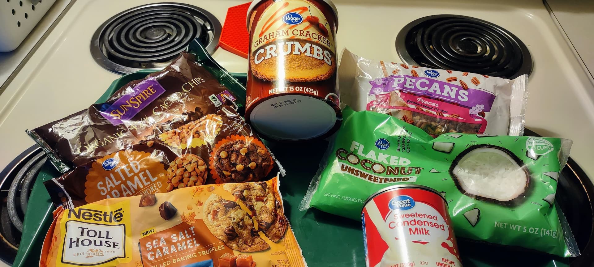
The title says eight layers… but technically they are seven-layer bars. However, I always make them with at least eight layers, or nine, or ten, or eleven. Regardless of how many layers they have, they are a delicious treat that kids and adults will love eight-layer bars.
They are a favorite around the holidays. My family has made them for Christmas going back to when I was a kid, but you can make them any time of the year. I recommend microwaving them for a few seconds to make them soft and gooey, but others prefer them room temperature.
Eight-layer Bars History
Magic cookie bars, Hello Dollies, coconut dream bars, dessert bars or eight-layer bars. The names of this dessert are as diverse at the ingredient variety. But how did it start and where did all the strange names come from? As the owl commercial says, the world may never know.
The bars have been traced back to the 1960s where there are numerous stories about how the various varieties were born. However, there doesn’t seem to be any single origin. It’s possible many at the time simply started experimenting with different ingredients and various varieties started to be popularized through TV, book, and newspaper appearances.
What about the history within my own family? It’s not actually my family’s recipe. Even though I remember them being made for Christmas quite far back, it wasn’t my family’s (or even the family it was acquired from) recipe. After acquiring my grandmother’s recipe book, it states right in it that it was from her neighbor.
A simple search online shows it to be the Eagle Brand recipe that was printed on the back of their sweetened condensed milk cans starting in the 60s. Or possibly from a reprint of it in a local newspaper. Either way, it was a commonly known recipe. However, I’ve altered it with my own ingredient substitutions and additions over the years.
Easy To Bake But Stay Away From Prepackaged
These cookie bars are simple to make, require just a few ingredients, and about 30 minutes to make, but will be the talk of the school and office. They have a very distinctive taste, but don’t get them from a store. Few grocers make them and they tend not to have good flavor. Many store-bought sweet treats work well but seven-layer bars are not one of them.
Customizable
There are a lot of options for baking chips. I often use chocolate along with a couple of others. You can use semi-sweet chips though I prefer milk chocolate. Feel free to experiment. Use light or dark chocolate chips. Butterscotch, peanut butter, and salted caramel chips are what I typically include. While my grandmother’s generation were adamant about sticking to recipes, you can be creative and make them your own.
As for the nuts, you can leave them whole or crush them into smaller pieces. Place them into a bag and smash them partially with a hammer. Some leave them whole, but we prefer them in pieces. Pecans, walnuts, peanuts, macadamia nuts, cashews… use your favorites.
Allergy Warning
This recipe contains nuts and coconut. If you or anyone you who many consume these cookies are allergic to any of the ingredients you may want to leave them out or substitute with other ingredients.
In someone is allergic to or simply dislikes coconut, you may try substituting shredded white chocolate or oats. If a nut allergy is involved you can try substituting for sunflower or pumpkin seeds.
Eight-layer Bars Cookie Recipe
Ingredients
½ cup (one whole stick) butter
1½ cup graham cracker crumbs (1 package + 4 crackers)
2 or more bags chocolate or flavored cooking chips
1 cup shredded coconut (sweetened or unsweetened)
1 cup pecans or walnuts
1 can sweetened condensed milk
Instructions
Heat oven to 350°F.
Put butter in an 11×17½ inch pan and melt in the oven. Alternatively, put in a microwave-safe bowl and melt 20-30 seconds then pour into pan. Spread melted butter over entire bottom of pan to create an even layer.
Add remaining ingredients in the order given.
Bake for 20 minutes (oven heat & times may vary, check periodically).
PHP version 8.2 was released on December 8, 2022 and I’m sure you’ve already heard about the great new features. The Randomizer & random generator engines classes, DNF types; constants within traits; the sensitive parameter trait; static return types for dates; the n regular expression modifier; false, true, and null types; the readonly class modifier, a handful of deprecations, and a small performance bump.
These features are great. They add some new things to play with, fix a few issues, and provide the usual speed boost. What about the more subtle features that aren’t reported on. They need some love too.
phpinfo()‘s Visual Upgrade
The first thing I will go over is a feature that doesn’t appear to be reported on anywhere. Not even in the changelog. Why?
The phpinfo() function got a facelift. It now supports dark mode using the OS and browser’s CSS prefers-color-scheme media query. There is also now sticky headers for tables. The headers will stay at the top of the screen while you continue scrolling.
Some other new features that go unnoticed…
Opimized code path for newly created files using the file:// stream wrapper.
Lower memory usage for strings created by various different functions.
Added support for curl’s CURLOPT_XFERINFOFUNCTION progress callback option. This replaces the deprecated CURLOPT_PROGRESSFUNCTION option.
Added support for curl’s CURLOPT_MAXFILESIZE_LARGE option which sould be used instead of CURLOPT_MAXFILESIZE in cases where the file is greater than 2 gigabytes.
Added curl_upkeep(callable) function that accepts a callable (function/method) and is used when HTTP2 keep-alive/ping requests are sent.
The idate(format, timestamp) function now supports the “N” and “o” specifiers to get the ISO day of week and ISO year respectively.
Added the FILTER_FLAG_GLOBAL_RANGE option when validating with the FILTER_VALIDATE_IP flag in the filter functions. The filter will fail when non-global IPV4/IPV6 IP ranges are used in accordance with RFC 6890 where the Global attribute is false.
A number of Apple Mac-specific memory and JIT compiler-related improvements.
Added ini_parse_quantity(string_value) function to convert parsed shorthand ini values that may include a number of supported units to integer value.
Added memory_reset_peak_usage() function to allow checking for excess memory usage multiple times throughout a script.
Upgrade Soon!
PHP 8.2 has many features that will make development and testing with PHP easier. It’s easy to overlook the more suble and less-reported-on features, but they are often some of the more useful or awaited changes. It’s highly reccomended that you upgrade to version 8.2 soon and always keep your software versions up-to-date to get the latest features and security fixes.

